Tuesday, March 25, 2014

Drawing Furniture

Tonight's sketch is a low back, bar height chair.  I tried to capture the major steps in the process that I've been using.  This has changed dramatically in recent weeks and will surely continue to evolve.

Cherry with tiger maple back splat, and green upholstery because that's the only non-wood-tone color I have at the moment.


I start by ghosting in my perspective lines and the general outlines of the chair.  A 2 point perspective seems to work well for furniture.  Focusing more on getting the initial layout for the perspective right makes a big difference in the over feel of the final drawing.


Next I switch a softer pencil and start to darken the lines that I want to work with.


Next I will refine the outlines with a pen, in this case with sepia ink.


Outlines complete, note that I only lay in lines that delineate sharp transitions.  The seat cushion is only outlined with no lines for the soft edges.


Now I choose my color pallet. For each color I like to have at least three tones, highlight, mid-tone and shadow.  With the alcohol based markers it is possible to blend the three to get most tones in between as needed. 


Starting with the lightest marker in the set I block in that color and then start working on defining the mid tones.


Then the shadowed areas.  Within a given region there will be variations in tone and by creating as much contrast as possible, you can reinforce the shape of the piece.


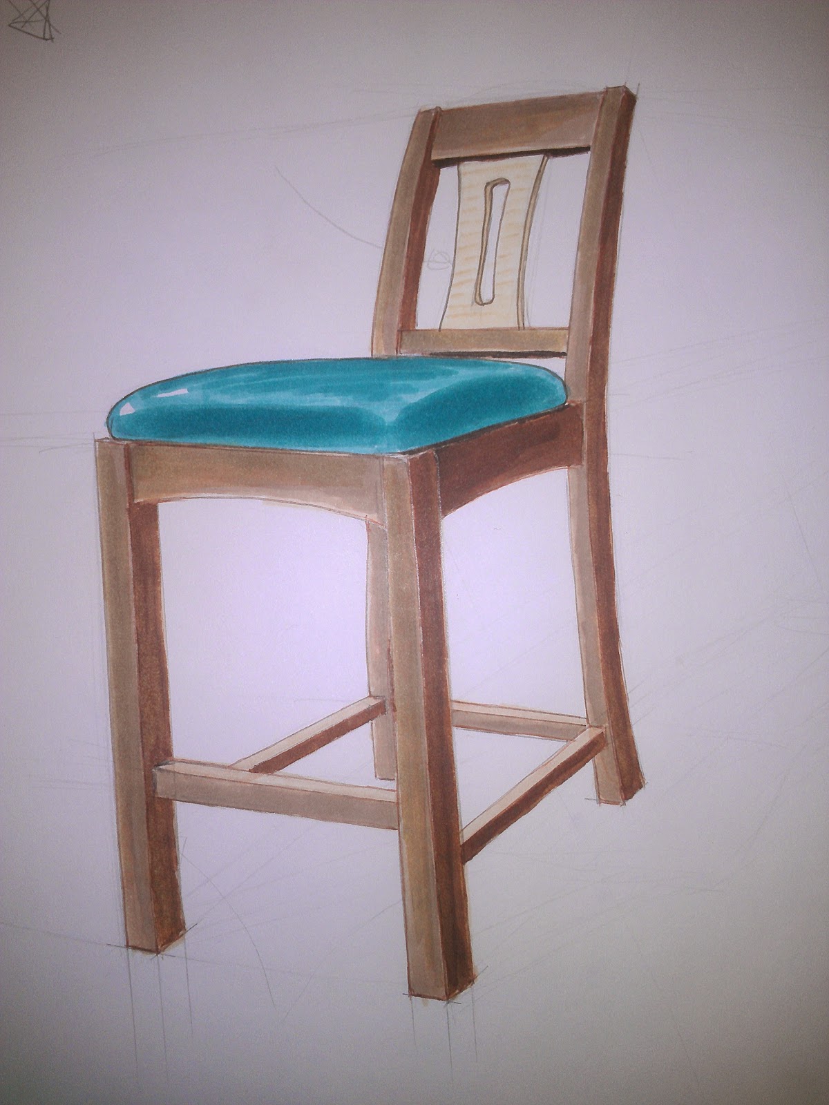
With the frame filled in I tackle the back splat and seat.  Leaving some white space on the edges of the seat give the feeling a somewhat glossy surface.  The glossier it is, the more contrast there would be between the highlights and mid-tones on the seat surface.


Next I add in a shadow to help ground the chair. 


My final step is to go over the shadow edges with black ink and the highlight edges with white gel ink.  The white gel ink does a great job of making the seat pop as well. I also added some grain lines with the sepia ink pen.  This is particularly effective on larger expanses of wood. A little more contrast for the shadow and its done.


Thursday, March 20, 2014

Hand Rendering Furniture

On nights that I'm not motivated to head down to the shop I've been doing some sketching to work out designs for future projects and just improve my sketching.  Here are some of the recent sketches.


Something that I find useful is to create sketches of existing designs, this helps to develop my eye for proportions and various design elements that I may want to use.


I tried to capture a bit of my process...seem to have missed some big pieces.  I start with a pretty hard pencil 4H or 6H and lightly sketch in my perspective lines and the basic frame. Sketching lightly allows me to slowly add detail and build up the line weight without having to try and erase.  Instead of erasing lines, just ignore them and darken the ones you want to keep.


These images shows my next step after I lay in all the detail with pencil.  I like to fully ink the sketch to provide nice clean lines.  Lately I have been using some Prismacolor fine line pens to do this as they are light brown ink and provide softer lines than black ink.


I will try and get a series of picture for my marker sequence sometime soon.  I am finally figuring out a good process that gives me Good contrast while conveying the textures and colors of the wood.


I stepped back and spent some time experimenting with rendering different species of wood.  This exercise was really useful.


Here is a rendering of a table design that I've been kicking around for awhile.


I wasn't feeling like dealing with the markers last night so I created a series of smaller thumbnails for sideboards.  For me, drawing out the various designs help me understand what aspects of them I like and those that I don't.

Wednesday, March 19, 2014

Greene and Greene Wall Shelf - Part I

This project arose from a few different considerations.  I wanted to try and use some lumber that I already had and wanted to be able to complete the build in three weeks of evenings.  The shelf is for cookbooks and recipes from magazines.  It will be near the whiskey cabinet I built last year so the intent is keep the design language the same.


 I started by creating a series of thumbnail sketches of various designs.


I was able to lay out the pieces for the wider design on the existing material.  We decided that the wider shelf would be useful.


To create a drawing of the design I started by laying out perspective and major form details. 


Next I use a fine line pen to ink the lines.


I transferred the layout onto some marker paper and filled in the color.  


As I was planning on working with existing materials I didn't bother creating detailed layout drawings, instead just working from the rough dimensions.  I ended up cutting the drawer fronts from the center of a board to get the maximum color.


The one wide board was enough for the sides and top.  The shelf and bottom were glued up panels.  Luckily the grain blended well I was able to keep the glue line out of the exposed tenons.


I decided to cut the dados for the drawer divider by hand.  This was a good exercise, luckily I started on the upper dado.  


Today I drilled the countersinks for the screws that will reinforce the finger joints and cut the drawer parts to size.  I am really pleased with the drawer fronts.


Next up will be the drawers themselves and then the sanding for the case before glueing it up.

Thursday, March 6, 2014

Markers and such...

With the completion of big project I always seem to have need some time away from the shop.  I've spent some time cleaning up but there are plenty of tools to sharpen and some small shop projects that I should take care of at some point.  Instead I've been playing with markers.

Natalie is leaving for a few weeks of training soon and I've decided that I need a project to work on while she is gone.  I want something that I can reasonably complete (at least mostly) in 3 weeks.  Once she gets back we plan to start on a major house project and I want to be at least close to wrapping up any shop projects before then.

I have been compiling a list of pieces that we need for the house and have been working on designs for several of them.  My goal is to eventually get far enough ahead on my designs that I can pick and choose what to work on based on the time I have available and which project is motivating me.  Separating the design and construction of the projects also allows me design a lot more pieces than I will have time to build and will hopefully help me develop my sense of style for furniture into something a bit more cohesive.

I have been doing a lot of sketching lately and have been experimenting with different media for creating renderings of designs.  There isn't much information that I have been able to find specifically about rendering wood for furniture design.

The best results so far are a mix of markers and colored pencil. Below is a collection of sketches and renderings of a few of the pieces that are in the works.


This is an end table design that will go with the recently completed TV stand.  


It will be built mostly from cherry, likely using curly cherry for the drawer front and side panels.


The idea is to use a 16" marble or granite tile, set into a bridle jointed frame, for the top.


I experimented with more of an Arts and craft feel, though that was not received too well. This and the previous image are water color images.  I really enjoy working with water colors, but they are tough in a sketchbook without really heavy paper.


This is the current design of this piece.  I am finally getting a feel for the markers and am having pretty good luck with them.  


This might be the project that I end up building over the next few weeks as I already have the lumber for it and I should be able to complete it in three weeks.  It is small, wall hanging book shelf intended to hang in the kitchen and hold cook books and recipe cards in the drawers.  It will be mahogany to match the whiskey cabinet I built last year.


Kind of a mixture of Greene and Greene and Krenov. 


Tonight I worked on a color rendering of the shelf with ambrosia maple drawer fronts.  i think this is pretty close the design I will go with.

I have a mix of Prismacolor markers and a few Staedtler ones.  I just ordered a small selection of Copic markers which I look forward to trying.  Most of my renderings tend to be sketches that get inked with a black drafting pen and then colored.  The last sketch above I did the underlying sketch with a light colored pencil and then went straight to the markers.  Once I had the main color blocks established I began to had some detail with colored pencils.  Using a white colored pencil for highlights and a couple brown pencils for details such as grain seems to work quite well.

If anyone has any experience or suggestions with regard to rendering wood textures for furniture design I would love to hear it.